ARTicles
Colour Mixing – a Personal Reflection.
Are there really hard and fast rules when it comes to colour mixing for watercolour painting?

There are quite a few books, web posts and video tutorials concerning colour mixing, which I am in no doubt, have been produced to help explain the "dos and don’ts" of mixing colour. They all seem to have the same formula: introduction to colour theory, warm and cool colours, base their guidance around a limited palette and invariably use colour names for watercolours that are made and sold by one particular brand of art materials. Most, if not all are aimed at beginners, who soak up all this advice and leave with the idea that there is “no other way” to mix colour and paint in watercolours.
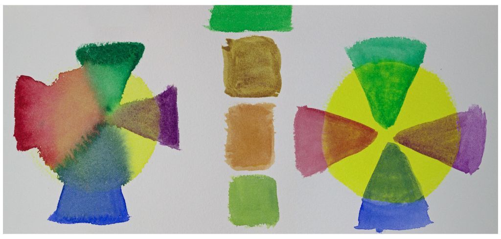
However, before we look more closely at the "dos and the don'ts" of colour mixing, I thought it would be good to touch on the technique of mixing watercolours, as it is often forgotten that the resultant colour can be slightly different, depending on how you mix (see figure 1). In my experience as a watercolourist, there are three ways to mix watercolours:
- On the palette;
- On the painting;
- Over laying transparent washes.

Figure 1: The three mixing techniques: (a) mixing on the painting, (b) mixing on the palette and (c) over laying transparent washes
Mixing on the palette, is generally the most common method. It can lead to a fairly messy paint box, if your preference is to use pan colour. When using moist watercolour, mixing can be done at full strength (actually blending the moist watercolours together), or diluted (dipping a wet brush from one colour to another). Mixing on the painting itself, whilst the watercolours are still wet, keeps the paint box and palette relatively clean and can best be done by loading different brushes with the chosen watercolours, then bring them together on the painting. The technique of overlaying transparent washes produces the cleanest colour mix, but requires that the first watercolour down is completely dry before applying the next (and so on). It also requires that transparent or semi-transparent watercolours are used, although semi-opaque and opaque colours can be used but these need to be the first ones applied.
Let me now turn my attention to colour mixing and through a number of questions, reflect on what I think is useful, helpful, and important. Colour mixing can seem a little daunting at first, but becomes second nature with experience.
Do we really need to know about colour theory?
Colour theory is a fairly complex series of ideas, which describes all aspects of the science of how light interacts with coloured surfaces and how the human eye sees colour, through to the more sensory aspects (Wikipedia - Color Theory). As artists, not all aspects of colour theory are relevant, but knowing a little can help, especially when we are trying to describe our colour perceptions.
So, for me it is useful to know and speak of each colour in terms of:
- Value – describing a colour’s lightness or darkness;
- Chroma – describing the colour’s saturation, purity or intensity;
- Hue – is the “colour’s” name, for example is it a red, yellow, blue, etc.
Another concept worth keeping in mind is that we painters use subtractive colour mixing, in that when we mix the colours of the rainbow together, we don’t end up with white (additive colour mixing), but black! Similarly, the Wikipedia article points out that even with three “pure” primary colours, it is not possible to mix all possible colours, but only a limited range. The failure to achieve all possible colours has often been described as being due to impurities or imperfections in the colourants used, but the fact is, that only the “imaginary primaries” used in colorimetry can achieve this (Wikipedia – Color Theory).

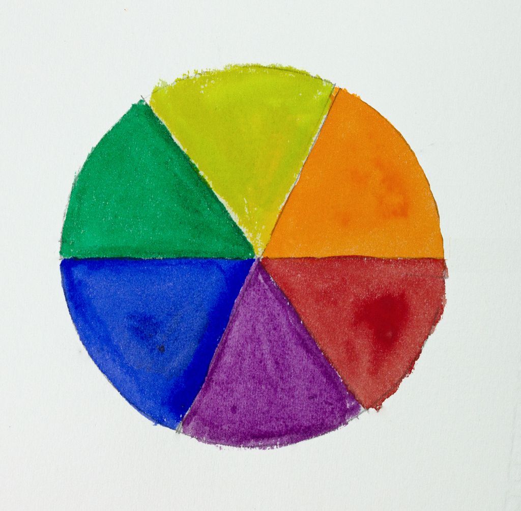
Figure 2: The watercolours used to paint this colour wheel, were all single pigmented; Cadmium Lemon Yellow, Cadmium Orange, Cadmium Red, Manganese Violet, Ultramarine Blue and Phthalo Green (YS) from the A J Ludlow Professional Watercolour Range.
The use of complementary colours is another aspect of the theory, which among artists, is considered important to use. Basically, complementary colours are those that cancel out each other’s hue, thus producing grey or black (subtractive) or white (additive). Often explained using a six segment colour wheel made up of the primary colours, red, yellow and blue, separated by their secondary colours, purple, green and orange (see figure 2). The complementary colours are those opposite each other: yellow and purple; red and green; blue and orange.
Here is a question for you the reader: is the result of mixing a primary with a secondary to cancel each other out as predicted by this complementary colour concept, or just the fact of mixing three pigments together?
The results of a two pigment “complementary mix is very different to a three pigment mix as can be seen in figure 3. The Cadmium Red - Ultramarine Blue - Cadmium Yellow mix has resulted in a dark brownish grey, where as the Cadmium Yellow - Dioxaine Violet mix does not. This would suggest that the presence of the additional pigment in the three pigment mix is the determining factor resulting in cancelling the hues and not the complementary colour concept.

Figure 3: A comparison between (a) mix of Cadmium Yellow with Dioxaine Violet (a “complementary” mix of two single pigmented watercolours) and (b) mix of Cadmium Yellow (primary) with a purple (composed of Cadmium Red and Ultramarine Blue) secondary colour.
The colour theory also defines the abstractions of Shade (darkening of colour value) and Tint (to lighten colour value). Changes in colour value by the addition of black in order to darken and water (in watercolour painting) to lighten, can unfortunately result in a hue shift in the original colour. These colour shifts can be neutralised in both shade and tint (as can be seen in figure 4), by using the complementary colour to produce shades and addition of a small amount of the adjacent colour (with respect to the colour wheel) to create a tint (Wikipedia – Colour Theory).

Figure 4: (a) Cadmium Yellow shades with (LHS) Ivory Black (showing a green shift) and (RHS) Dioxaine Violet (showing darkening but no hue shift) and (b) addition of Isoindolinone Yellow (LHS) to Anthraquinone Crimson (showing no hue shift to the tint) and the blue-shade wash with just water (RHS).
Are warm and cool colour classifications useful?
As watercolourists, we often talk about warm or cool primary colours, as these are often considered to be the foundation of our colour palette and the building blocks of colour mixing. Sometimes they are also referred to as split primaries and by using both cool and warm yellows, reds and blues (six colours in all) the range of colours that are possible to mix, is much larger than with just the three “pure” primaries discussed above. In my Professional Watercolour range, I have designated Cadmium Lemon Yellow, Anthraquinone Crimson and Phthalocyanine Blue (Green Shade) as my cool primaries, whilst my warm ones are Cadmium Yellow, Cadmium Red and Ultramarine Blue. Even with these six single pigmented watercolours, I would be inclined to add Phthalocyanine Green (Yellow Shade), Dioxaine Violet and maybe one or two earth colours to my regular palette, just to have a wider selection of single pigmented watercolours to draw on.
Is it important to use a limited palette?
I’ve mentioned single pigmented watercolours for a reason, as this is generally the part of the colour mixing equation that gets neglected in the pursuit of achieving the “holy grail” of a limited palette, that doesn’t limit the number of achievable colours.
With watercolour, chroma is greatly affected by the number of pigments in each of the paints used and this in turn is related to the shape of the pigment’s absorption spectrum; the sharper the absorption spectrum, the brighter and purer the colour. It therefore follows that in pigment mixtures each pigment will obviously absorb light and so there are a number of absorption bands, which broadens the spectra and so results in a distinctly duller hue (see figures 5 and 6).


