ARTicles
Pigment Stories – Interesting Blues; Ultramarine, Anthraquinone and Prussian Blues
A periodic look at the stories behind the pigments used in A J Ludlow’s Professional Watercolours

Following on from my earlier ARTicles, spotlighting the pigments used in my professional watercolour range, I would now like to turn our attention to the pigments used in the Ultramarine, Prussian and Anthraquinone Blues.
The pigment stories of Ultramarine Blue and Prussian Blue are very much interwoven and have been available to the artist for centuries, whilst Anthraquinone Blue is a relative newcomer to the artist’s palette. Each pigment has a different story to tell, based on its discovery, its history and its chemistry.
Ultramarine Blue
Pigment Details: Sulphur containing Sodium Aluminosilicate / Colour Index Pigment Blue 29 (C.I. PB29)
When the blue pigment derived from the semi-precious blue stone, lapis lazuli was first introduced into Europe in the 15th Century, where it came from and how it was produced was shrouded in mystery and the pigment was known only to have come from “beyond the sea”, hence it became known as oltramarino by the medieval Italians (from the Latin word ultramarnius) and at the time, the name also referred to a number of other imported goods. In England, the pigment was known as ultramarine.
At the time most of the lapis lazuli used in both western and eastern art came from the mines in Afghanistan (Finlay 2002, page 313). Being a semi-precious stone, the pigment derived from lapis lazuli was expensive and its quality and colour intensity depended on the purity of the seam from which it was mined. The search for alternative less expensive blue pigments, spurred on no doubt by Heinrich Diesbach’s accidental discovery in 1704 of Berlinisch Blau (what we now know as Prussian Blue), led to the eventual discovery of an “artificial ultramarine”.
Around 1787, the German scientist and writer Johann Wolfgang von Goethe, observed and commented on blue deposits on the walls of lime kilns near Palermo. He noted that these deposits were used as substitutes for lapis lazuli in decorative applications (“Ultramarine” accessed on 29/04/22). Further observations of blue compounds on lime kilns by others, led to the Societé pour l'Encouragement d'Industrie in 1824, to offer a prize for the discovery of a chemical process to produce ultramarine by a synthetic route. In 1828 the French industrial chemist, Jean-Baptiste Guimet was awarded the prize for his process, the details of which he kept secret and later exploited commercially. At the same time the German Chemist. Christian Gmelin published his own process and because of this he received the recognition for this discovery. The synthetic version was also called ultramarine, although it is sometimes known as French ultramarine (after Guimet).
The synthetic ultramarine is based on the three-dimensional aluminosilicate lattice with a sodalite structure containing entrapped sodium ions and ionic sulphur groups (from “Pigment Compendium”, page 381). It is interesting to note that other similar synthetic pigments based on the same aluminosilicate-sodalite structure are also referred to as ultramarine (for example, Ultramarine Pink), but are no longer thought of as coming from “beyond the sea”. In the figure below, the aluminosilicate (SiAlO4) lattice (a) comprises of cages (c), known as β cages, in which the polysulphide ([S3]-) anions are surrounded by 4 sodium ([Na]+) cations (b). A crystal of ultramarine blue (d) will be formed of several of these β cages stacked as shown in figure 1.

Figure 1: Graphical representation of the chemical and crystal structure of C. I. Pigment Blue 29 (after Hsiao, 2017)
It is interesting to note that the Colour Index Pigment Blue 29 can refer to either the natural mineral, lapis lazuli or the synthetic form. In both compounds the chromophore (or colour centre) is the polysulphide groups (which gives the mineral its blue colour), which explains why the pigment’s colour changes from blue to grey (the normal colour of the sodalite structure), accompanied by the smell of rotten eggs (caused by the liberation of toxic hydrogen sulphide (H2S) gas), when treated with mildly acidic liquids (for example, lemon juice as shown in figure 2).
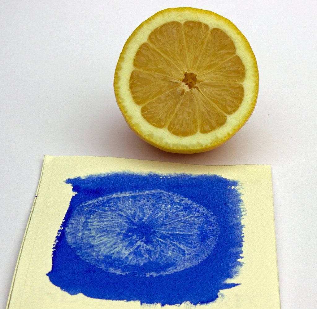
Figure 2: The effect of lemon juice (mildly acid) on dried Ultramarine Blue watercolour.
Lapis lazuli is still mined and available as a pigment for artists’ colours and is available as special colours in other manufacturers’ ranges. However, the mineral deposits used now for pigment frequently containing high levels of silicate, which if not removed will dilute the blue lazurite, causing the pigment’s hue to be less intense and dull. Synthetic ultramarine on the other hand is a more vivid blue, since the particles are smaller and more uniform, making this pigment the best choice for Ultramarine Blue in my professional quality watercolour range, because of its purity, light fastness and intense red shade blue hue.

Figure 3: Graduated washes on white and black paper (showing the transparency) of Ultramarine Blue Professional Watercolour and where the colour has been lifted out.
The Ultramarine Blue’s red shade allows this Professional watercolour to be used on the artist’s palette as a warm primary blue. The watercolour’s tendency to granulate and high colour strength can be used to full effect when painting wet-in-wet or in dilute washes.
Prussian Blue
Pigment Details: Iron (II, III) Hexacyanoferrate (II, III) / Colour Index Pigment Blue 27 (C.I. PB27)
As mentioned above, the metal complex pigment, iron hexacyanoferrate (Colour Index Pigment Blue 27) was serendipitously synthesised in Berlin around 1706 by the colourman Diesbach The pigment was originally named Preußisch blau (Prussian blue) and Berlinisch blau (Berlin blue), but is also known as Paris blue, Milori blue and the greener shades, Chinese blue.
Heinrich Diesbach was originally trying to prepare a crimson pigment from the dye, cochineal by precipitating it using a salt containing potassium carbonate (that had been unsuspectingly contaminated with offal). Instead of the expected crimson lake, Diesbach produced a blue precipitate of iron hexacyanoferrate as the contaminated potash (potassium carbonate) had contained a mixture of nitrogenous organic bases (including pyrrole) and alkyl cyanides from the thermal degradation of compounds such as hemoglobin (Ware, 2008). It has been claimed that this is the first synthetic pigment, but Mike Ware states that Egyptian blue (a calcium copper(II) silicate, whose recipe was lost in the Roman era is probably the first, but Prussian blue is better described as the first synthetic coordination compound. The process to produce Prussian Blue was kept secret up until 1724, when John Woodward published a method that used dried ox-blood as the starting material, then as the science of chemistry began to yield it secrets, the French chemist, Pierre-Joseph Macquer in 1752, showed that the pigment could be reduced to a salt of iron and the yet unknown acid, hydrogen cyanide*. At the time the unknown acid was named Blausaure, meaning “blue acid” (because it was derived from Prussian blue) and Prussic acid in England (“Prussian blue”, accessed on 29/04/22).
It was no surprise that Prussian blue began to replace the expensive blue lazurite pigment as the artists’ blue of choice. However, its deep intensity of colour, which at full strength is almost black, has led to the addition of white pigments in order to lighten the intensity of the pigment. According to Ralph Mayer, the colour Antwerp blue is a pale variant of Prussian blue made by reducing the iron hexacyanoferrate with 75% of an inert pigment, usually alumina hydrate, which sometimes contains zinc salts (Mayer, 1991). The difference in hue between Prussian and Antwerp blue is negligible as can be seen in figure 4a, but there is an obvious difference in tinctorial strength (figure 4b).

Figure 4: Prussian and Antwerp blues: (a) comparison of graduated washes and (b) tinctorial strength (10 white : 1 colour).
There is mixed opinion as to whether Prussian blue is a light fast pigment, as there is evidence that it does fade as a recent study has found, but in all fairness, pure iron hexacyanoferrate pigment is seldom used in artists' colour formulations just on its own. Kirby and Saunders discovered that alumina hydrate and ferrihydrite, often found as impurities in the pigment prepared by the early manufacturing processes, reduce the pigment’s light fastness (Kirby, 2004). The presence of ferrihydrite, which is yellow, leads to a greener shade Prussian blue (Grandjean, 2016) and alumina hydrate is often used as an inert filler in Antwerp blue and student quality watercolours due to its acceptable transparency in gum Arabic solutions.

Figure 5: Graduated washes on white and black paper (showing the transparency) of Prussian Blue Professional Watercolour and where the colour has been lifted out.
My Prussian Blue professional quality watercolour contains only the pigment and no inert fillers. If it is necessary to reduce the colour’s intensity, it is best to use dilute washes and so use the whiteness of the watercolour paper to reduce the intense blue. Mixing Prussian Blue watercolour with my Binder and Painting Medium will also reduce the colour’s intensity and still maintain the qualities of a professional watercolour (see figure 6b).
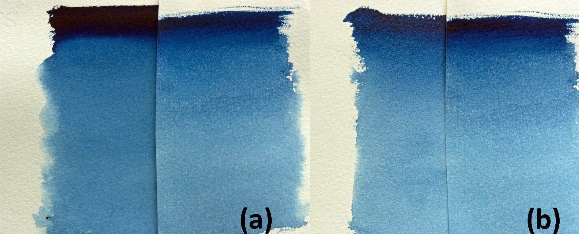
Figure 6: Comparisons of colour intensity (a) Prussian (100%) vs Antwerp blues and (b) Antwerp vs Prussian (50%) blues.
Anthraquinone Blue
Pigment Details: 6,15-dihydroanthrazine-5,9,14,18-tetrone / Colour Index Pigment blue 60 (C.I. PB60)
Anthraquinone Blue Professional Watercolour is prepared using the synthetic organic pigment, 6,15-dihydroanthrazine-5,9,14,18-tetrone. It is what is known as a “Lake” pigment, that is a pigment that has been made by precipitating a dye with an inert binder, usually a metallic salt. Why this type of organic pigment is called a “lake” is not documented but according to the Wikipedia, the term “lake” has its origins in the term lac, which are the secretions of the Indian wood insect, Laccifer lacca (“Lake pigment” accessed on 29/04/22). So, the use of the word may have its reasons in the dried secretions, which are refined into shellac or the fact that these insects also exhibit a crimson body colour due to the presence of water-soluble polyhydroxy-anthraquinone (lac dyes) in their bodies and it was the red pigment lakes that were particularly important in the history of art.
C.I. pigment blue 60 is made from 2-aminoanthraquione treated with potassium hydroxide in the presence of a potassium salt. First patented in 1901 by BASF, as the first anthraquinone vat dye, it was branded “Indaththren”, which is an acronym for Indigo from anthracene (“Indanthrone blue”, accessed on 29/04/22). As a vat dye, it is used to colour cotton and is known as C.I. Vat Blue 4, whilst the pigment has very good light fastness and transparency (see figure 7a) and is often used as an alternative to natural indigo, albeit with a small addition of carbon black (see figure 7b). The pigment is also called indanthrone blue and indanthrene blue, hinting at BASF’s original brand name.


