ARTicles
Pigment Stories – Cadmium Scarlet, Red and Maroon, Anthraquinone Crimson and Quinacridone Rose and Magenta
A periodic look at the stories behind the pigments used in A J Ludlow’s Professional Watercolours
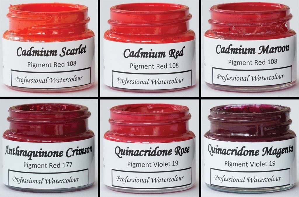
Following on from my earlier ARTicles, spotlighting the pigments used in the yellow and orange watercolours in my Professional Watercolour range, I would now like to turn our attention to the pigments used in the three cadmium reds, Anthraquinone Crimson and the two quinacridones, Rose and Magenta.
Cadmium Scarlet, Cadmium Red and Cadmium Maroon:
Pigment Details: Cadmium Sulphoselenide / Colour Index Pigment Red 108 (C.I. PR108)
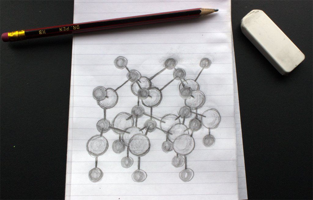
All three cadmium reds are prepared using mixed crystal inorganic pigments of cadmium sulphoselenide (or cadmium sulphide selenide), where the three different shades are achieved with different ratios of cadmium selenide to cadmium sulphide in the pigment crystals. Both cadmium sulphide and cadmium selenide take on the wurtzite crystal structure (as shown in figure 1), they show mutual solubility and form solid solutions. In the generalised sketch, the lattice positions of the cadmium ions are shown as the darker spheres, whilst the larger anions are the lighter coloured spheres. Depending on the ratio of anions, the shape of the crystal lattice will be different, as the sulphide ion (S2-) is much smaller than the selenide (Se2-) one.
Figure 1: Sketch of the Wurtzite crystal structure, where the metal cations are shown as the smaller darker spheres and the anions are shown as the larger spheres.
Pure cadmium sulphide is yellow, whilst pure cadmium selenide is red, thus the ratio of these two compounds in the pigment will therefore influence the pigment’s hue, as the more cadmium selenide the redder the pigment will be. It therefore follows that of all the three reds, the pigment used in Cadmium Scarlet has more cadmium selenide than Cadmium Orange, but less than Cadmium Red as it has a bright and clean orange-shade hue and can be used on the artist’s palette as a warm primary red and as an alternative hue to genuine vermilion (C.I. PR106).
Figure 2: Graduated washes on white and black paper of Cadmium Scarlet Professional Watercolour and where the colour has been lifted out.
Again it follows that the pigment used in Cadmium Red contains relatively more cadmium selenide than the pigment used in A J Ludlow’s Cadmium Scarlet Professional Watercolour and Cadmium Maroon pigment, even more. The temperature of calcination is also known to affect the pigment’s hue (the higher the temperature the redder the colour) and so also contributes to the final hue of the cadmium pigment.
Figure 3 and 4: Graduated washes on white and black paper of Cadmium Red and Cadmium Maroon Professional Watercolours and where the colours have been lifted out.
Whilst Cadmium Maroon is a bright and intense blue-shade red, Cadmium Red, which is also bright and intense, can be used on the artist’s palette as a brilliant mid-shade red or warm primary red and so can be mixed with yellows to create warm oranges and with blues to give a selection of beautiful purples.
Figure 5: Three colour primaries mixing circle, showing the colour mixes with Cadmium Red.
The red shade cadmium sulphoselenide pigments have excellent heat stability, a high degree of light fastness and chemical resistance, making them ideal for use in a professional quality watercolour range. As with the cadmium pigment used in the yellows and orange watercolours mentioned in previous ARTicles, these cadmium red watercolours can be on the opaque side in heavier layers, but in thin washes they are bright and show good transparency due to the fact that only the pure pigment is used and because the high degree of pigmentation used in my Professional watercolours, ensures a strong colour even when heavily diluted.
Although containing cadmium, this metal’s bioavailabilty in the pigments used in our watercolour is very low and so the pigments are considered safe for use in our Professional watercolour range.
Anthraquinone Crimson:
Pigment Details: 1-Amino-4-(4-amino-9, 10-dioxoanthracen-1-yl) anthracene-9, 10-dione / Colour Index Pigment Red 177 (C.I. PR177)
Anthraquinone Crimson Professional Watercolour is prepared using a synthetic blue-shade red organic complex, from the anthraquinone-type class (see figure 6) of light stable and high-performance pigments.
Figure 6: Illustration of the chemical structure of the C.I. pigment red 177 molecule.
The pigment, 1-Amino-4-(4-amino-9, 10-dioxoanthracen-1-yl) anthracene-9, 10-dione (C.I. PR177) was first introduced as Cromophtal Red A3B in 1967, so is a relatively modern addition to the artists’ colour box. This pigment is also referred to as “Anthraquinoid Red”; anthraquinoid being another name for the anthraquionone-type pigments.
Figure 7: Graduated washes on white and black paper of Anthraquinone Crimson Professional Watercolour and where the colour has been lifted out.
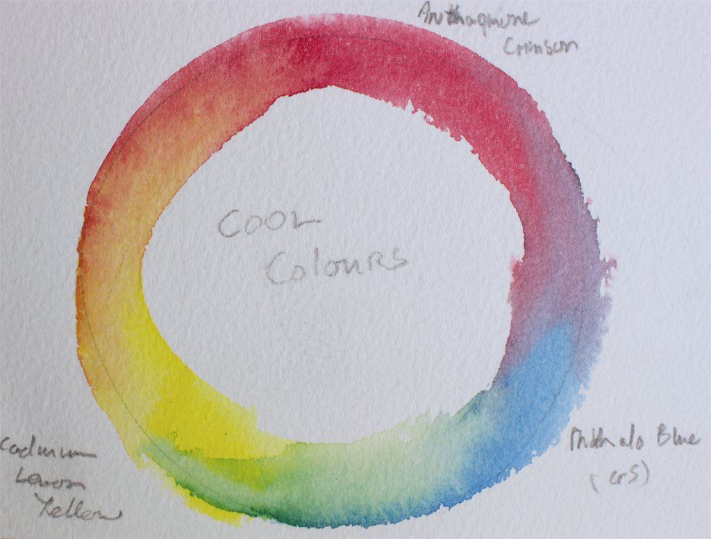
This pigment is often found on the modern watercolourist’s palette because it is used as a good shade alternative for the fugitive natural anthraquinone lake pigment derived from the madder root, Alizarin Crimson (C.I. PR83). This has led to C.I. pigment red 177 being referred to as a “Permanent Alizarin Crimson” in some watercolour ranges because of its good light fastness and as this particular anthraquinone pigment has an almost identical hue, it can be used on the artist’s palette as a cool primary red and in exactly the same context as C.I. pigment red 83 (Alizarin Crimson).
Figure 8: Three colour cool primaries mixing circle, showing the colour mixes with Anthraquinone Crimson
Traditionally, Alizarin Crimson occupies an important area on the watercolourists’ palette. Its blue-shade red is often considered as a cool primary red. It can be used to create a wide range of rich purples and browns and is often used as the red component in painting Caucasian flesh tones.
The original Alizarin Crimson was derived from an anthraquinone compound extracted from the madder root, eventually, the alizarin compound was synthesised in 1868 when Carl Graebe and Carl Liebermann produced a “synthetic alizarin lake” (C.I. PR83:1) from anthracene. Unfortunately, this synthetic equivalent’s permanence was no better and so still had poor light fastness. A number of Artists’ watercolour ranges, still contain the synthetic Alizarin Crimson based on C.I. pigment red 83:1 as well as the misnomer of a “Permanent” version, usually based on a pigment mixture.
Quinacridone Rose and Quinacridone Magenta:
Pigment Details: Quinacridone / Colour Index Pigment Violet 19 (C.I. PV19)
The pigments used in both the Quinacridone Rose and Magenta Professional Watercolours are from the quinacridone family of organic compounds, which are a versatile sub-group of polycyclic pigments that can vary in colour from deep orange (C.I. PO48 and 49), through red (C.I. PR122, 192, 202, 206, 207 and 209) to violet (C.I. PV 19 and 42) depending on the nature of any substituent groups.
First produced as pigments by Dupont in 1958, C.I. pigment violet 19 quinacridones can vary in colour from deep red to violet, depending on the way the quinacridone molecule (shown in figure 9) orientates itself within the pigment’s crystal structure.
Figure 9: Illustration of the chemical structure of the C.I. pigment violet 19 molecule.
The two forms I use are the red γ-quinacridone, which is used in the Rose and in the Magenta, β-quinacridone because of its deep reddish violet colour. According to Paulus et al, the γ-crystal modification is characterized by a criss-cross lattice, where each quinacridone molecule hydrogen-bonds to four neighbours via single H-bonds; whilst the β phase, consists of linear chains of molecules with double H-bonds between each quinacridone molecule and two neighbours. The formation of hydrogen bonding within the pigment crystal, increases the conjugation of the π-electron system of the molecule’s rings, shifting the colour from yellow (the colour of isolated substituted benzene compounds) to the characteristic red-violet colour of the solid-state pigment (Paulus et al).
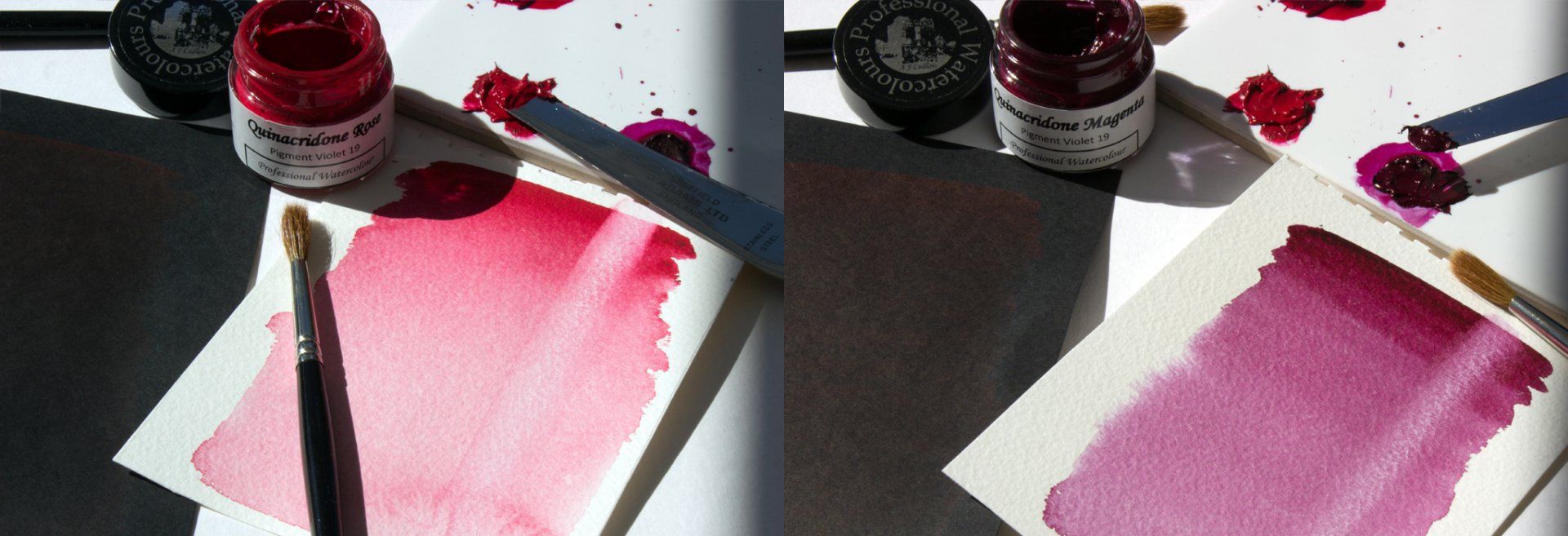
Figure 10 and 11: Graduated washes on white and black paper of Quinacridone Rose and Quinacridone Magenta Professional Watercolours and where the colours have been lifted out.
Quinacridone Rose and Quinacridone Magenta are two of the few organic pigments used in A J Ludlow’s Professional Watercolour range. Organic pigments tend to have smaller crystal sizes than inorganic and mineral pigments and so exhibit considerably high colour strengths and staining power. This is true for both A J Ludlow’s Quinacridone Professional Watercolours, as they have a high tinting strength and so are best used sparingly when initially mixing with other colours.
Quinacridone Rose can be used to create attractive purples when mixed with Phthalocyanine Blue (Red Shade) and beautiful oranges, whilst Quinacridone Magenta can be mixed with Ultramarine Blue and Cobalt Blue to create attractive purples and beautiful oranges with Cadmium Lemon Yellow.
***
I hope this ARTicle has been of interest to you. In next month’s feature we will shine the spotlight on the pigments used in the pink, mauve and violet colour space in my Professional Watercolour range.
Paulus EF, Leusen FJJ, Schmidt MU, “Crystal Structures of Quinacridones”, CrystEngComm, 9 (2), 131

