ARTicles
Pigment Stories – Isoindolinone Yellow, Cadmium Orange and Titanium Orange
A periodic look at the stories behind the pigments used in A J Ludlow’s Professional Watercolours

Figure 1: Drawing of the chemical structure of the isoindolinone yellow molecule.
The pigment was first discovered in 1946 and commercialised some 20 years later, so the isoindolinone pigments are relatively new to the artists’ palette. It can be synthesised so it is opaque as well as transparent.
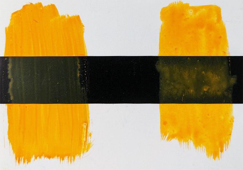
Figure 2: Transparent (on the left) and opaque versions of C.I. pigment yellow 110.
In general, organic pigments tend to have relatively smaller particle sizes and larger surface areas, giving them a tendency to have higher tinctorial strengths (the strength of the colour increases with decreasing particle size) and be more transparent (as the smaller particle size scatters less light), which can affect the cleanness of the resulting watercolour’s ability to “lift-out” and so watercolours based on organic pigments have a greater tendency to stain. The structured consistency of the highly pigmented Isoindolinone Yellow, like the other watercolours based on organic pigments in my Professional Watercolour range, is due to the pigment’s relatively larger surface area, which absorbs more liquid binder, thus affecting the watercolour’s rheology.
Figure 3: Graduated washes on white and black paper of Isoindolinone Yellow Professional Watercolour and where the colour has been lifted out.
The Isoindolinone Yellow watercolour is a bright and intense red shade yellow, which can be used on the artist’s palette as a warm yellow. It is normally found in blended colours, rarely on its own, even though its hue is similar to that of traditional Indian Yellow (C.I. NY20) and so can be used as a lightfast alternative.
Cadmium Orange:
Pigment Details: Cadmium Sulphoselenide / Colour Index Pigment Orange 20 (C.I. PO20)
Although first discovered earlier, cadmium orange was first introduced to artists in 1862 at the International Exhibition in London. Its composition, may have been quite different from its modern counterpart, possibly based on cadmium sulphide or cadmium selenide, as the cadmium orange based on a solid solution of cadmium sulphoselenide was not fully commercialised until 1910 with further process improvements made in 1919.
The pigment used in my Cadmium Orange Professional Watercolour is a solid solution of cadmium selenide in cadmium sulphide. The ratio of the two cadmium compounds influences the pigment’s hue as the more cadmium selenide the redder the pigment will be. The temperature of calcination will also affect the pigment’s hue and colour strength; the higher the temperature the redder the colour. The pigment I use has a bright and clean yellow-shade orange.
Figure 4: Graduated washes on white and black paper of Cadmium Orange Professional Watercolour and where the colour has been lifted out.
The pigment has excellent heat stability, a high degree of light fastness and chemical resistance, making it ideal for use in a professional quality watercolour range. As with cadmium pigment based yellows mentioned in a previous ARTicle, this colour can be on the opaque side in heavier layers.
Although containing cadmium, this metal’s bioavailabilty in all the cadmium pigments we use in our watercolours is very low and so these pigments are considered safe for use in our Professional watercolour range.
Titanium Orange:
Pigment Details: Rutile-Tin-Zinc Complex / Colour Index Pigment Yellow 216 (C.I. PY216)
The Titanium Orange watercolour has a beautiful red-shade orange hue, which is different to Cadmium Orange. The pigment used in this watercolour is a mixed metal oxide inorganic pigment, containing zinc, tin and titanium oxides. In addition to its hue, I selected this pigment for its light fastness and chemical resistance.
The pigment’s structure is based on the rutile (TiO2) lattice (figure 5), which gives the rutile-tin-zinc complex its opacity, whilst the incorporation of the tin and zinc cations results in its colour.
Figure 5: Sketch of the Rutile crystal lattice, where the metal cations are found at each corner and one in the middle of the unit cell. Each metal cation is coordinated with 6 oxygen anions (in this sketch only the six oxygen atoms are shown coordinated to the central metal cation).
The resultant watercolour is opaque in heavier layers and easily granulates on rough watercolour paper (as can be seen in figure 6).
Figure 6: Graduated washes on white and black paper of Titanium Orange Professional Watercolour and where the colour has been lifted out.
The fact that this colour is opaque, does not follow that it is a gouache or body colour with the same properties. With gouache colours, white pigments are used to achieve opacity in water-based colours and when painted out produce a flat, uniform area of colour, which was why they were popular with designers and illustrators. By not using white to achieve opacity, but the actual physical properties of the pigment, Titanium Orange watercolour will have greater brightness and colour intensity and will not give a flat, uniform area of colour.
Today watercolour is generally defined as the traditional “transparent” technique, working from light to dark and using the white of the paper to provide the highlights in the painting, anything else is often frowned upon as not being pure watercolour. However, during its heyday in the mid-19th century, the majority of watercolour artists during this time were using a mixture of transparent and opaque effects, showing that there is a place on the watercolourist’s palette for both transparent and opaque watercolours.
***
I hope this ARTicle has been of interest to you. In next month’s feature we will shine the spotlight on the pigments used in the three Cadmium Reds, Anthraquinone Crimson and the two quinacridones, Rose and Magenta.


